
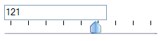
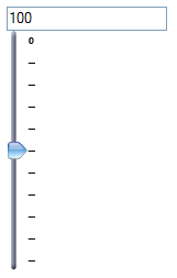
Slider component based on Yahoo UI slider widget. Allows setting the value of an input text by a slider.
| component-family | net.sf.yui4jsf |
| renderer-type | net.sf.yui4jsf.component.SliderRenderer |
| component-class | net.sf.yui4jsf.component.slider.Slider |
| renderer-class | net.sf.yui4jsf.component.slider.SliderRenderer |
| tag-class | net.sf.yui4jsf.component.slider.SliderTag |
<yui:slider for="id_of_an_inputtext"
				styleClass="CSSClass"
				style="width:220px;..."
				thumbClass="CSSClass"
				thumbStyle="width:20px;..."
				thumbImage="thumb.png"
				left="0"
				right="100"
				up="200"
				down="150"
				tickMarks="25"
				animate="{true|false}"
				type="{horiz|vert}">
</yui:slider>
<yui:slider>
Standard Attributes - id, rendered, binding
for - Id of the component that the slider will be used for.
styleClass - Style class of the slider background.
style - Style of the slider background.
thumbClass - Style class of the slider thumb.
thumbStyle - Style of the slider thumb.
thumbImage - Image of the slider thumb.
left - Number of pixels the slider can move left.
right - Number of pixels the slider can move right.
up - Number of pixels the slider can move up.
down - Number of pixels the slider can move down.
tickMarks - Fixed pixel increments that the slider will move in.
animate - Boolean value to set an animation when slider background is clicked, default is true.
type - horiz|vert, Specifies the type of the slider.